Interview!

The role of the editor

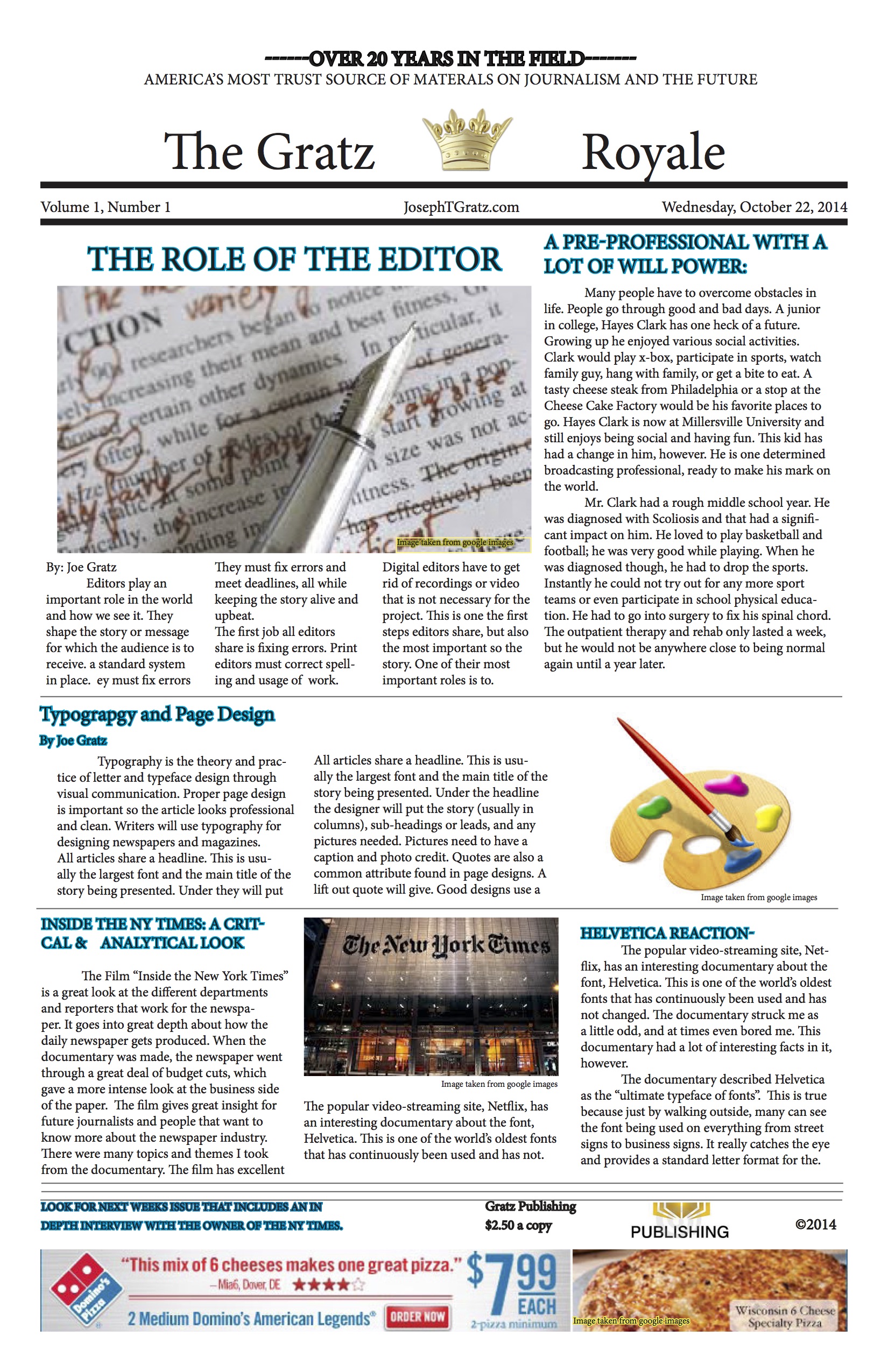
Editors play an important role in the world and how we see it. They shape the story or message for which the audience is to receive. One of their most important roles is to keep a standard system in place. They must fix errors and meet deadlines, all while keeping the story alive and upbeat.
The first job all editors share is fixing errors. Print editors must correct spelling and usage of their authors work. Digital editors have to get rid of recordings or video that is not necessary for the project. This is one the first steps editors share, but also the most important so the story is clearly understood. Fixing errors can involve the editor to fact check, proof read, and help the author stick to his message.
One of the editor’s most challenging tasks is meeting deadlines. They constantly need to hassle their writers or directors, for their work. Getting behind can cost their company a lot of money, or cause the media in which they are working for to run short time or layout wise. Typically books do not have strict deadlines but the editors must keep in touch with the author so he or she does not get lost in his or her work. News, T.V., and film editors have to keep receiving medium so the project or program can continue to produce a show or writing on time. By keeping deadlines, editors act as a project manager.
Editors have a unique relationship with their writers. They must butcher the work to get it up to a certain level while also being the parent or therapist to that writer so the work is excellent. They do this so the overall theme and angle can remain consistent. Since editors tend to be at the highest in the hierarchy in which they work, they also have other responsibilities like keeping a budget, hiring writers and doing planning and development for the business they work at. Editors really get an omniscient viewpoint of the whole chain of media being presented. Editors are coaches, puzzle masters, and are truly a key feature to journalism, media, and literary books.
Typography and Page Design

Typography is the theory and practice of letter and typeface design through visual communication. Proper page design is important so the article looks professional and clean. Advertisers, event planners, and business owners use typography without even knowing it. Writers will use typography for designing newspapers and magazines. Anything that is printed and used to show a mass audience or even a small audience (like an email between two people) is a part of typography. Page design will help the publication flow nicely and not be full of jargon. Using typography and page design wisely will guarantee your message is clean and understood. When publishing a piece of work it is important to understand how to correctly typography and page design.
The first thing a writer needs to understand when designing a publication is page design. The overall design of the page will provide page design will determine whether or not customers respond to the article or pick it up. Headlines, artwork, and text boxes provide and organized and varied look for a document. Tameri.com suggests each page a person designs should also have a fair amount of invisible elements. These elements are items such as margins, columns, and frames/borders. The use of them will make ones work stand out and better organize it so it has a visual appeal. Customers do not want a document that is covered from top to bottom with words. It needs to show case certain items and organize them so the message is aided. Good page design will include a good balance of visible and invisible objects.
Typography is the second item of business needed when creating an article. Typography deals with fonts and its presentation. The two basic forms of font are Serif and non-Serif. In Serif fonts one can see “a clearly defined stroke whereas non-serif is very block and straight line formatted” (depaul.edu). Size is another matter dealing with typography. When communicating, writers write for their work can be read. A common size for reading font is 9-12. Larger fonts are used to show yelling, aggression, or titles. Smaller fonts are read to showcase fine print. Using a smaller font is usually for citations or items that need to be said but are not imperative to the message. The style of the font plays into typography. The letters, or wording, need to be visualized in a way that enhances the authors tone. Using different fonts, colors, or visual aids (like art, bold, underlined, or italics), will the to tone or style the author is trying to get across.
How to write a news story

If you are a journalist, you need to be able to write a news story. There are many hints to use when writing your story. It is important to know the do’s and don’ts of news.
One thing to never do is write a long story. The audience will not have time to follow it and they will loose interest. When one watches or reads news they are really looking for headlines. Headlines should never have a date in them. They need to be creative and engaging. IF there is a date, it will date your work, which in turn could hurt you. It is also important to never start a sentence with the person or title, start the sentence of your “news” with the action. This will really engage the audience.
There are also many “do’s” when writing news stories. DO answer the 5 W’s… who, what, where, when & why. A news story is news after all, so when writing, make sure they W’s are all answered. DO use an inverted pyramid method. The most important idea is first, and then tickles the facts down from most important to least important. Nouns and verbs are great, especially descriptive ones.
News story writing is simple but it’s important to remember the Do’s and don’ts for optimal achievement. Keep the news short, and engaging.
Feature Story Explanation

Feature Story’s
Print and online journalism have a lot of stories in their literature. The stories will vary in length and content. Feature stories are the most common type of story. They are able to cover a lot of information compared to a quick news article. The feature story is able to go in depth and not only give the audience a quick over view, like hard news.
The first step when writing a feature is to plan it. The author must research the topic to know everything there is to know about it. He must use that research to then choose an angle. He will narrow the information down slightly to make the news feature interesting and engaging. This process will involve a lot of brainstorming before the actual writing will occur.
After planning the feature story, the author will now write it. The author can either use an attention grabber to draw in the reader or he can use a narration method to keep the story growing. In the feature, one must use a picture, quotations and be descriptive to convey the story properly to the reader. The nice element with writing a feature story is length. Length tends to be a lot longer in a feature because the editor or producer for the work wants the audience to be very knowledgeable on the topic.
Once the feature is written, it will go through edits to ensure it is at the best quality it can be. The feature will be formatted according to its medium and will then be released. The best features have a great attention grabber and great content to keep the reader focused. They do this with visuals, quotes, and writing style.
In Design application in poster form!

NY Times Review

Inside the New York Times
The Film “Inside the New York Times” is a great look at the different departments and reporters that work for the newspaper. It goes into great depth about how the daily newspaper gets produced. When the documentary was made, the newspaper went through a great deal of budget cuts, which gave a more intense look at the business side of the paper. The film gives great insight for future journalists and people that want to know more about the newspaper industry. There were many topics and themes I took from the documentary.
One of the first main topics I took was the use of Twitter in journalism. Twitter is an ever-changing social media that trends very current, real life news that comes from everything from the average Joe, to celebrities. The New York Times surprised me by the documentary telling viewers how often the journalists are really on social media. It is a huge outlet for reporters to gain story leads, and ideas.
Another point I gained from the video is how professional and important the reporters were. I appreciated the “board meeting” that took place each and every afternoon to decide the papers story’s they were to run. It demonstrated the need for journalists and reporters to be on time. Deadlines are important. Group work is especially important. The idea of deadlines is important to papers because they want to be the first one out with the current trending story. The more viewers the paper can attract the better they’ll do in advertising, which will awards them with money. The professionalism of the paper is especially important because there story’s need to be correct, they need to have proper sources and they need to always investigate story and ideas.
A theme that surprised me was the office space for the journalists. Their workspace shocked me. The New York Times is one of the most respected and well-developed papers of our age. The workspace for their employees was very boring and plain with all of the cubicles the building had. I was expected a more creative feel like Google or many magazines have.
Toward the end of the movie, it was depressing to see the New York Times have to layoff people. Many businesses and corporations go through this at some point. I thought the CEO handled it very well however and used their resources wisely. The layoff section really opened my eyes to just how competitive this field is.
Inside the New York Times is a nice film that provides great depth into the journalism field. The inside look is very creative.
Helvetica the Font & my Reaction to the Movie
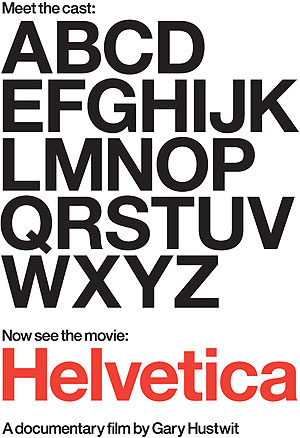
The popular video-streaming site, Netflix, has an interesting documentary about the font, Helvetica. This is one of the world’s oldest fonts that has continuously been used and has not changed. The documentary struck me as a little odd, and at times even bored me. This documentary had a lot of interesting facts in it, however.
The documentary described Helvetica as the “ultimate typeface of fonts”. This is true because just by walking outside, many can see the font being used on everything from street signs to business signs. It really catches the eye and provides a standard letter format for the viewer to see. The font itself has been around for over 50 years. It originated in Europe and has since spread through out the entire world as a standard font. The documentary took an interesting look at the font by examining the opinion of many different style experts. They presented their view and told different alternatives. There was one man who hated the font. He said, “it’s so plain but so irresistible”. The fact that Helvetica is everywhere definitely adds to the documentary’s credibility. It makes the font seem like an important aspect of life.
The films artistic vision seemed a little off to me. It was formatted in a way that there was little narration. The story moved by interviews and the interviews transitioned with pictures, or b-roll showing examples of Helvetica being used. The music was dry and a lot of the time the interviews just show cased people rambling about art and design. I personally am not an art guru so the film had very boring material. Even though the film was dry, I appreciated the science aspect of it. It did a great job at explaining to the viewer how that shapes and line formation needed to match up perfectly to certain letter for better flow.
Helvetica is definitely a font everyone should know… even if they don’t know that certain letters had a name. The documentary on Netflix provided an interesting look on the font. I would not recommend watching it, but if you appreciate the appreciation of art or fonts, it may interest you.
An Example of a Tabloid Layout